Having too much choice
is one of the main obstacles for 21st century designers. With virtually unlimited tools and possibilities at our fingertips in the digital age, our creativity can become clouded very easily. Being inundated with thousands of photoshop brushes or fonts can push the very concept of a design from the forefront of your mind.
Cluttered' is how I would describe the Internet. Wading through endless list posts, unread RSS feeds and unusable forms takes up the better part of my day. There's just way too much 'stuff' everywhere and the majority of it has no added value.
Consider removing the clutter the next time you are writing a lift pitch for your business. Can you do it in 25 words instead of 50? Can you do it in ten? One?
Take Google's mantra:
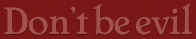
Putting aside any personal views you have on Google and how good you think they are, you have to admire this as a single mission they have for their company. So simple, so powerful, Boom! It works on so many levels.
They wanted it to be stuck firmly in the minds of both their employees and customers.
I have to be honest, Google's is the only mission statement I know.
Why? Because there's no bullshit. •
• I can't even begin to imagine how many business cards I've thrown away over the years. Seeing a little 85 × 55mm piece of card absolutely stuffed with phone numbers, addresses, email addresses, fax numbers, blood types, really just makes me cringe.
One business card I have kept though is from the HTML 5 genius Yaili.
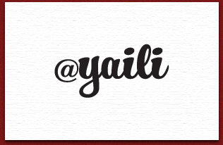
This is all Yaili has on her card. Beautiful isn't it? Yaili clearly knows that the kind of people she will be handing this card out to at conferences are other web geeks. They will instantly know this is her twitter name and if they want to find her website it will be on her bio there, or simply googling ‘Yaili’ will land you upon some of her fine work. Sure, Yaili could have put her phone number, email, website all on there but I'm pretty sure I wouldn't still have it stuck to my wall.
I understand from a functional point of view, it's essential to have all your contact information stored on your business card, but that's not what Yaili was going for. She wanted to create something that people would desire and appreciate. She spent the time to get the perfect font, get it printed so elegantly and embossed so that geeks like me would be scrambling for one.
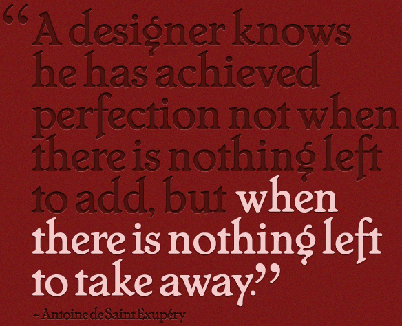
I still keep this card not only because it looks so gorgeous, but because it's also a reminder of how much you can achieve with just one word.
Scary stuff
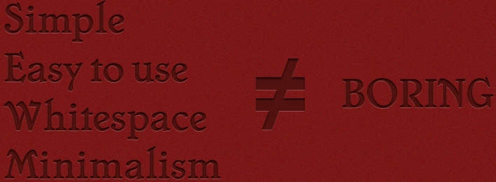
Simplicity and minimalism are pretty scary terms for a client to wrap their head around. I'm sure you have all heard so many times 'can we fill up that white space there?' and 'it's a bit too simple, we don't want people to think we didn't put any work into it.'
Simplicity does not necessarily mean that there is no personality. Apple have some of the most iconic products in the world because there's been so much time put into intelligent design. You can easily tell a mac from any other laptop, but could you tell any other laptop from any other laptop? Apple's product line, also simple. They do a few products but do them exceedingly well. Too many companies think that having the widest product range is what appeals to people, letting the quality and the experience suffer.
But what's all this '4 pixels or less' malarkey?
Well, feeling inundated with the amount of fonts, brushes, images, patterns, gradients, drop shadows and copy I generally squeeze into each day, I set myself a little minimalistic design challenge.

By completely limiting myself to just four blocks of colour, could I express the whole concept of the movie effectively? I don't have a lot of options with this.
Or do I?
I mean, I have every colour possible to represent a movie. Some movies are known for one particular colour, and I have 4 chances to use colour! That's a hell of a lot to work with already when you think about it. •
• I have position also at my disposal. Putting certain colours at the top and others at the bottom gives an instant message to the viewer. Green on the bottom, Blue on the top = Landscape with sky.
So here's what I did (scaled up so you can see clearer) I've hidden the names so you can have a go at guessing. Rollover to reveal the answer.
Enjoy!
- Titanic
- Pulp Fiction
- Star Wars
- Kill Bill
- Avatar
- Jaws
- Dark Knight
- The Matrix
- Taxi Driver
- Finding Nemo
- Toy Story
- Shaun of the Dead
I took the idea of minimalism to the extreme here, but the point of this article is to show you what can be done with the smallest of resources. Strip away the unnecessary clutter from your work and you will end up with something far simpler and more effective. You don't need to have a sidebar filled with twitter streams and banner ads. Just keep the essentials and push your creativity and the results will be far superior.
Challenge yourself daily.
Simple.